Animating masks
I wanted to tray an animation technique which would look like something was being drawn. I remember watching a video a few years ago for the yo frankie open game project which described how to draw on dirt paths and details using a black and white image mask.
The process is called texture splatting and can be found here.
So I used some stuff from an old project and used them to set up something similar to the video shows.
Grass texture
Stone texture
Combined using node set up
Nodes setup, it takes the 2 textures and mixes them by a value of the mask.
the problem with this is that it is not scalable in any easy way . I would usual scale the UVs on a tillable texture to tile more.
So I instead used materials which gives control over the amount of repeats.
using materials with the texture repeating 10 times made this :
So now the basis is there and it works in engine, time to test the animation of the mask.
I made this quick animation map which should make the dirt area grow from a small circle to a full dirt image.
(Animation maps start at the bottom left then work right and up)
This worked :D
But it looked due to the way animation maps work. I tried something to fix this to play only ounce.
This logic brick set-up adds 1 to a property called anim every frame. then checks when anim = 40(trial and error till i got the right number) and replaces the plane with another plane which has only the 1 texture applied. I also tried adding a new mesh and deleting the original both methods worked but don't know what is most efficant yet.
I tried a sketch animation:
This worked:
I tryed this through the view field in the node set up and again came up with the problem of not knowing the scale of the image needed to fill the camera properly. I was trying the view to check if i could create a simple mask overlay which could be sued to draw several characters and objects.
This picture shows the same mask as above but the view makes it far to lange for the plane.
Now a test iv been meaning to do for a while but have been putting off. Getting the view space image proportions right.
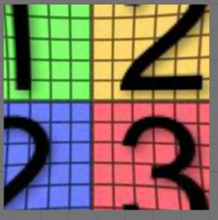
I downloaded a uv cheker grid with numbers and placed it in the vie space.
Image used
Here was the result: (notice there is a lot of the image not being shown)
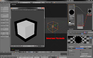
I edited the image to have some black borders. this was based on a guess from the previous image.
This turned out the be the right size but it has a weird fish eye effect on it.
I edited the image in photoshop to have a fish eye correction
This was a guess but it lined up pritty good
I have a better idea of what the area for the view images should be:
Its almost splitting the image into 9 segments and focusing on the middle segment.
Here is the scene i was wokting on in video format sorry didnt edit it attal:
insert video here.
Conclusion to this post is that animating masks work but there is more testing in view space to be done. I can make the animation play ounce but don't know if the way I did it slows the game or not.


Comments
Post a Comment