Pop Art Level First pass
its time to make the final level which weirdly is the first "style" you come accross.
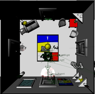
I decided to take the level out of the kitchen setting original planned and moved it to a generic room due to it being hard to fit a belevible kitchen design around a room wit 4 doors.
I looked at a lot of pop art room designs by Lichtenstein and made some of the elements to populate my room.
I started off with making the basic room shape and made materials which match the dots and lines on the walls of the originals. (i grouped the important nodes so i could reuse them in other materials)
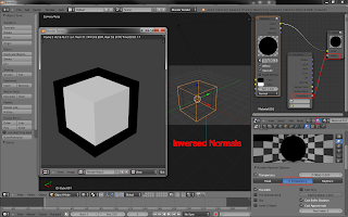
I then made a sofa as it appered in a few pictures.(I added the outline later with a scaled inverted mesh)
I drew in some outline in the texture to help define certain edges that wouldnt get shown by the mash outline.
Then I madea table and some plants and reused the texture from the old pop art test.
then another chair:
This only has a scaled mesh on the back and it tapers towards the botoom to avoid weird mesh isues.
Then in imported th roor from the house level and straightend it up because it looked weird when it was squint in pop art land.
Then i rigged the door and animated it to simply open and added a little bounce back. Then mate this animation trigger when the player is neer the door and then close again when the player moves away.
I put arrows on the back of the cans to help tell the player where to go to get to the exit .
I also removed a can in every room to give the player an idea that they are going in the right direction.
I added a few more props and paintings whitch help make the room fill up.
Here is the level in action:


This style is awesome. Also I love the door swinging animation :D
ReplyDelete