Showcase Preperations (Interface)
This post will be about getting the stuff ready for the showcase.
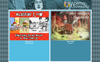
As I said before, I'm sharing a booth with Sam. We meet up and decided whos on what side,
I'm on the left and hes on the right.
(It would have been cool to have the image of the project the full size of the pannel)
When we first got the interface layout we didin't like the way it looked so we did a couple of edits and tested that we could get stuff working.
Its easy enough and i can launch my game from it as well as loading videos and images.
Things to include
screenshots of each style:
-standard house
-pop art
-water colour
-charcoal
-pen
-Possibly a couple of images showing the inspiration for the style ie , Scott C / Lichtenstein, with a comparison between the original and a screenshot from the game. This one might change...
Maby a contact page
Maby a contact page
-An image containing the critical framework.(might cut this page to show the 2 examples above, or add 4 more things)
-The video collage of all the tests from semester 1
-The final Game play video of The Art Collector
-An images which when you click it it goes to the game, (Click here to play if its not on show, or something like that)


The interface loads 5 thumbnails at a time and i have listed 10 items so it will neatly fit in 2 rows.
i might add some more images of tests from semester 1 with comparisons to the origonal artwork
like this :
i might add some more images of tests from semester 1 with comparisons to the origonal artwork
like this :
You'l all just have to wait till the show to find out exactly what slides are picked.


Comments
Post a Comment