Gunman Clive framework evaluation
Artwork deconstruction 1 (Gunman Clive)
Media
(Practical Media)
|
Wattercolor
|
Type of
(Paper, Canvas, Texture)
|
Old paper (western)
|
Colour Pallet
|
Sepia and pastel colores for background with stronger more vibrant tones
for characters.
|
Outlines
(Are there any, Thickness, Movement, colour, Texture, Wobbly )
|
Yes, varying thickness
|
Object fills
(Colour, Texture, Brush Strokes)
|
Wobly, inprocise , sometimes goes over he lines and sometimes doesn’t
go right to the line inside.
|
Solid drawing
(Dose the 3d shape remain consistent from all angles? sillowete)
|
Yes could be represented in 3d
|
Shading and shadows
(Colour in relation to rest of scene, Shape)
|
Darker shade of original color for shading, crosshatched shading in
parts
|
Animation/ Movement
(Sketchy, Precise)( Dry brushes/Blur Lines)
|
Yes, bullet trails?
|
Grading system how well something was achived : very good , ok , not at
all
Reconstruction in 3d implementation (Gunman Clive)
Media
(Get a general feel of the media)
|
Yes
|
Type of
(Post Presses 2d filter or overlay containing paper texture)
|
Yes, has a graphics quality slider whitch basically changes
the level of post prossessing. The highest level ads a vingete and a old
paper texture and a sketchy lines overlay which shows up on the shaded areas.
Animated sketch
|
Colour Palate
|
Yes this game sticks
to the colour papet very will using sepia and pastel, the characters might be
slightly more vibrant that they would have been in the origonals but it works
for a game.
|
Outlines
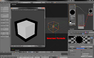
(Post process outlines? Scaled mesh inverted normals, textured view
or uv space, Animated, Wobbly displacement map,)
|
Yes darker version
of the main color, static, outline on characters sillowete is always the same
thickness but the texture detail inside varies.
|
Object fills
(Texture, uv or screen space? Bush Strokes in texture, Animated?)
|
Uv textures, along
with a double render technique whitch renders the outline and then the object
fill and destrotrs and shifts it so that it appears watercolory and obtains
the inacturite look, going out the lines
|
Solid drawing (Constrains, blend shapes, complex rigs, maintain 3d
sillowete)
|
Yes, no cheep
tricks, the backgrounds areamazing looking 2d whever your standing still but
the parallax effect is soo satisfying
|
Shading and Shadows
(Real time? Baked? Animated Shape? Masked shading/stencil)
|
2d filter on
characters whitch adds a sketchy pencil texture to shaded aeas, on ground
shadows it is a separate darker sketchy texture
|
Animation/Movement
(Sketchy, Precise, animated outlines and textures)( Dry
brushes/BlurLines, bill boarded planes with blur lines)
|
Yes bullets have
trails
|
Additional comments
|
This game took me by surprise and is well worth a play. The style was
just so relevant to this project and has some nice documentation on the guys
blog. The detail in the characters is simplified to a level that would probably
not be in the oriogonals and the colors are also exadurated but for a game on
this size of screed it works perfectly. Physical butons would have helped the
controlles but its avalible on desura.
|
8 out of 8


Comments
Post a Comment